- GitHub React project: https://github.com/nrhodes-hmc/cs124sp22-exercises
- branch: 15-responsive-design-starter
- If you haven't yet already cloned that project, follow the instructions.
- If you have already cloned that project:
- Pull the latest changes (git pull from terminal, or Git/Pull... menu from WebStorm).
- Checkout the specified branch above
- If using WebStorm:
- Edit package.json and modify the scripts object to add install-dependencies:
"scripts": { "start": "react-scripts start", "build": "react-scripts build", "test": "react-scripts test", "eject": "react-scripts eject", "install-dependencies": "npm install react-responsive" }, - Right-click on package.json, and select "Show npm scripts"
- Double-click on install-dependencies in npm pane
- Edit package.json and modify the scripts object to add install-dependencies:
- Otherwise, in terminal, run npm install react-responsive
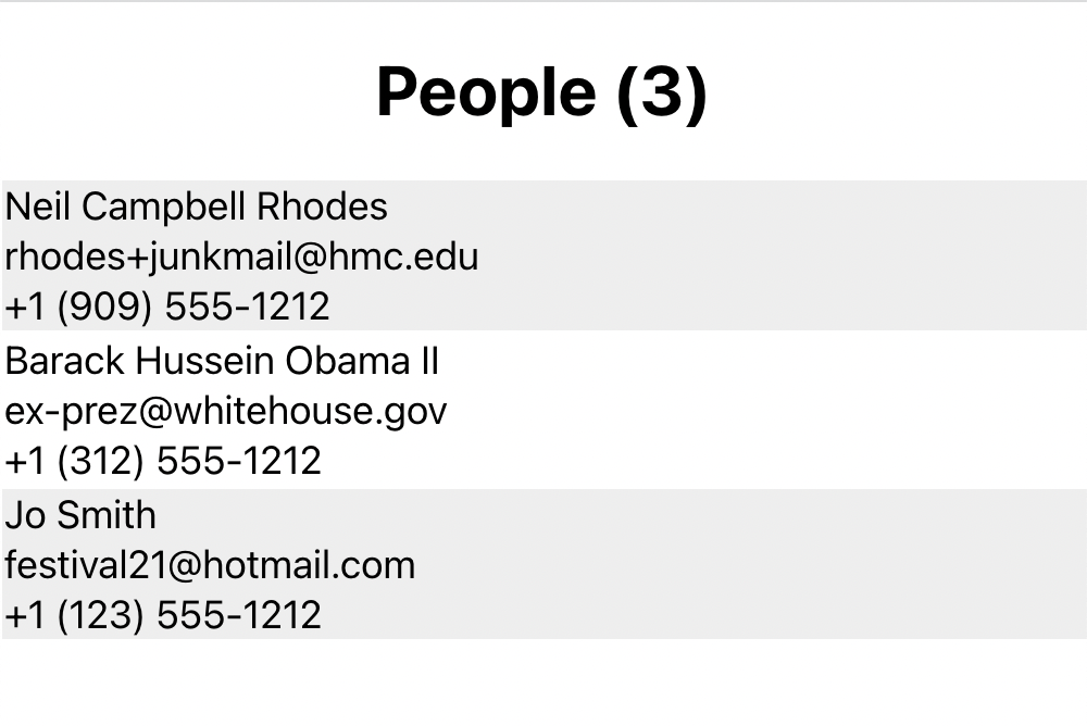
Notice that it requires horizontal scrolling as the screen becomes narrow.
- Add the tag that's necessary to enable responsive design.
Within the head of index.html, add:
<meta name="viewport" content="width=device-width, initial-scale=1" />
- In People.css, adjust the width of the table to be 100%.
- Now try. Notice that as you make the screen narrow, the rows become quite narrow and hard-to-read.
Hint: use nth-child(odd) in css.
-
Add a media query that is active when the width is 600 pixels or less and contains the following CSS rule:
/* Force table to not be like tables anymore */ table, thead, tbody, th, td, tr { display: block; } - Add a call to useMediaQuery in People.js to ensure that the header row isn't rendered if the width is 600 pixels or less.
- Reserve space at the left by adding the following CSS rule to the media query:
td {
    position: relative;
    padding-left: XX%;  /* set appropriate percentage here */
}
Make sure to set the value for padding-left to reserve enough space for the labels.
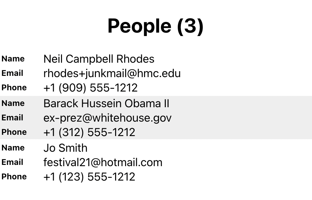
- Use the before selector to add some text before each cell:
td:nth-of-type(1):before { content: "Name"; }Add similar labels for Email and Phone.
- Make sure the labels are at the left of each row with the following CSS rule:
td:before {
    position: absolute;
    top: Xpx;  /* set amount for top padding */
    left: Xpx; /* set amount for left padding */
}
Make sure to set the values for top and left to set the location of the labels.
Also make sure that the labels are smaller and bolded.