Empirical Exploration
The scientific process relies on experimentation to test hypotheses and theories. An experiment can't prove that a theory is true, but it can refute a theory.
Asymptotics are one way to answer the question, “How does performance scale?”, but we can also answer that question empirically.
Empirical exploration can help us understand how different data structures perform in practice, as opposed to the theoretical performance and limits the asymptotics give us. In this part of the homework, you will run some experiments to compare the performance of different list implementations.
The Tools
In the homework directory, you will find three files that we haven't previously mentioned:
listperf.cpp- A program that runs a series of performance experiments on several list implementations, including your
IntListandIntVectorclasses, as well as several standard-library classes. It compiles into an executable calledlistperf. perf-to-data.py- A script that converts the output from
listperfinto a machine-readable format (TSV or CSV) that can be imported into a spreadsheet or graphing program. plotdata.py- A script that can draw graphs from the output of
perf-to-data.py(or any other file with similar performance data). Specifically, it can draw log–log plots similar to the ones on this page.
Each of these programs has a -h command-line option that describes how to use them.

Gah. Some of those tools take a lot of options. Do I need to understand the nuances of all of them?

You can, but you won't need to.

Also, there's one more file we haven't mentioned yet…
run-experiments.sh- A script that runs a series of experiments using the other three programs, and saves the results in the
Experimentsdirectory. You can run it as./run-experiments.sh. It will take a while to run but it will show you what's happening as it goes.
Running the Experiments
Run the script!
./run-experiments.sh
You should see output similar to the following:
+ mkdir -p Experiments
+ make clean
rm -f *.o snake intlist-test intvector-test
+ make 'OPTFLAGS=-O3 -flto' 'LDFLAGS=-flto' listperf
clang++ -g -std=c++20 -pedantic -Wall -Wextra -O3 -flto   -c -o listperf.o listperf.cpp
clang++ -g -std=c++20 -pedantic -Wall -Wextra -O3 -flto   -c -o intlist.o intlist.cpp
clang++ -g -std=c++20 -pedantic -Wall -Wextra -O3 -flto   -c -o intvector.o intvector.cpp
clang++ -flto -o listperf listperf.o intlist.o intvector.o
+ rm intlist.o intvector.o listperf.o
+ ./listperf --push-back
+ tee Experiments/push_back-results.out
Measuring IntList (push_back):
1.05828 µs to make & destroy list of size 100, peak heap usage 1600 bytes
3.04705 µs to make & destroy list of size 300, peak heap usage 4800 bytes
10.1075 µs to make & destroy list of size 1000, peak heap usage 16000 bytes
30.2027 µs to make & destroy list of size 3000, peak heap usage 48000 bytes
100.423 µs to make & destroy list of size 10000, peak heap usage 160000 bytes
306.486 µs to make & destroy list of size 30000, peak heap usage 480000 bytes
1076.48 µs to make & destroy list of size 100000, peak heap usage 1600000 bytes
3306.05 µs to make & destroy list of size 300000, peak heap usage 4800000 bytes
10707.8 µs to make & destroy list of size 1000000, peak heap usage 16000000 bytes
The output shows us that the script
- Creates the
Experimentsdirectory (if it doesn't already exist). - Cleans and rebuilds the
listperfprogram (with optimizations enabled).-O3enables high-level optimizations.-fltoenables Link-Time Optimization, allowing the compiler to optimize code across multiple source files.
- Runs
listperfwith the--push-backoption, measuring the time and space used by various list implementations when pushing items onto the back of the list.- Using
tee, the results are shown in the terminal and also saved to the fileExperiments/push_back-results.out.
- Using
-
What's a “deque”, and why is it called that?
-
It's pronounced “deck”, and it's short for double-ended queue, because we can add and remove items from both the front and the back.
You'll see that listperf measures the performance of several sequence (a.k.a. list) data structures:
IntList, a singly linked list, which you wrote.IntVector, a vector following Design 2, which we provided.std::list, a doubly linked list from the C++ standard library.std::forward_list, a singly linked list from the C++ standard library.std::vector, from the C++ standard library.std::deque, from the C++ standard library.
The output of the benchmarking program is designed to be both human readable, and easy to parse with a script. The run-experiments.sh script saves the output in Experiments/push_back-results.out; then, once experiments have run for all the other tests (--push-front, --equal, and --unequal), it runs perf-to-data.py to convert the output from each set of tests into CSV and TSV files, and then runs plotdata.py to draw graphs of the results.
All the resulting files end up in the Experiments directory. If you like, you can right-click on the folder and select to download it to your computer to make the files easier to explore.

Why have both CSV and TSV files? Aren't they the same thing?
-
The most meaningful difference is that CSV files use commas to separate values, while TSV files use tabs.

There are some other fiddly differences that can, in practice, make one format easier to work with than the other depending on what you're doing with the data.
.csvfiles- Are good for importing into a spreadsheet program such as Excel or Google Sheets. They also view very nicely with QuickLook on a Mac; just press Space when the file is selected in Finder and you can view the data as a table.
.tsvfiles- Are a bit easier to view in the terminal or a text editor, because tabs line up nicely (especially if you've set the tab length to a large value, typically 8 spaces). But they're also great for copy-and-pasting into a spreadsheet program, which is far less fuss than going through the menu options and dialog boxes you might need to import a CSV file.
If you're used to doing science and drawing graphs, you may already have a favorite program and be speedy at visualizing data with it. But our experience shows that students often try to use Google Sheets and get bogged down in the details of how to get it to do what they want, so we've provided you with plotdata.py, which can draw the kinds of graphs we want with a single command. As you may have noticed, the Experiments directory contains a number of PNG files with graphs of your results.
Some Example Graphs
The graph below shows a plot of space usage. Recall that to test how the algorithm scales we use exponentially increasing sizes, so we've used a log–log plot.
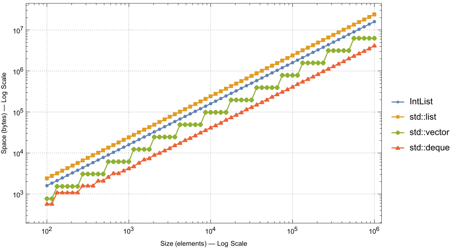
Notice that the graph omits IntVector, which has the exact same line as std::vector; and std::forward_list, which has the same line as IntList.
Why Log–Log Plots Are Useful
In a log–log plot, the function \( f(n) = k n^p \) will be a straight line, with slope \( p \), at a distance from the x-axis proportional to \( \log k \). Thus \( \Theta(n) \) and \( \Theta(n^2) \) functions can both have straight lines, just with different slopes!
We can see from the graph in Figure 1 that all the functions appear to have the same big-\( \Theta \) performance, but we can't just glance at the graph and immediately see what the true slope is (undistorted by axis scaling, etc.).
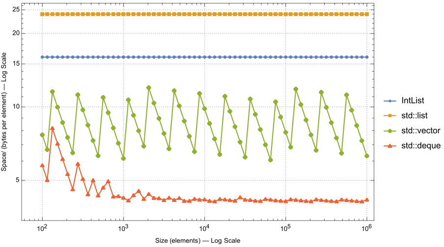
But theory can help us here. For these experiments, theory indicates that these algorithms use linear space; thus storing \( n \) items should require \( \Theta(n) \) space. So we can see if our experimental results are consistent with theory by dividing by \( n \). In other words, if we think \( f(n) \in \Theta(n) \), we should plot \( f(n)/n \), because a horizontal slope is easy to see.
The graph in Figure 2 adopts this approach and plots space-usage-per-element, and thus divides by \( n \).

Hay! Your graphs have lots more points than we get when we run
listperf.-
There's a constant you can change in
listperfto adjust the number of points:EXP_STEP. It's set to0.5by default, but if you change it to0.25, you'll get twice as many points. You may also want to increaseSIG_DIGITSto2.0or3.0if you changeEXP_STEP. 
Meh. I've got enough points. Shoulda been a command-line option anyway.

And they look like they were drawn with a different program, too.

The graphs on this page were drawn using Mathematica, which all students have a license to use. It can do all kinds of things! Mudd students can get access to download it (or use it on-line) here. (Others should check with their home college's IT department.)
-
In contrast,
plotdata.pyusesmatplotlib, a popular Python library for creating static, animated, and interactive visualizations. If you run it on your own computer instead of the server, it can even show you the graph interactively on your screen.
Questions
Note: On our 64-bit server, an int requires 4 bytes, and a pointer requires 8 bytes.
Note: Only the last part refers to a graph you've drawn yourself. The earlier parts reference the graphs shown in the homework write-up.
Further Exploration
If you have the time and you're curious, you can also explore some of the differences in performance that are created by the compiler. You can recompile your code using GCC's g++ compiler (GCC stands for the “GNU Compiler Collection”) by running
EXPERIMENTS=Experiments-gcc CXX=g++ ./run-experiments.sh
This command will create a new directory, Experiments-gcc, containing the results of running the experiments using g++ instead of clang++. You can then compare the results from the two directories against each other.
In addition, our server actually has two different versions of the C++ standard library installed. The Linux default is libstdc++, which is the GNU implementation that comes with GCC. But there's also libc++, which is the LLVM implementation that comes with Clang. Even though we usually use Clang as our compiler, it defaults to using libstdc++ for compatibility with other software on the system. But we can ask it to use libc++ instead by adding the -stdlib=libc++ option, so we can get another set of experiments by running
EXPERIMENTS=Experiments-libc++ CXX='clang++ -stdlib=libc++' ./run-experiments.sh
This command will create a third directory, Experiments-libc++, giving you another set of results to compare.
-
Now you can use the data to run all sorts of statistical analyses between the two sets of results!
-
*rolls eyes*
(When logged in, completion status appears here.)